Wednesday, August 24, 2011
747 Modeling Progress
Hi all,
Creating a 3D model of a 747 is a lot harder than i have anticipated.
Having prior experience in 3D modeling I taught that it will take me
a couple of days. So far it has taken me about two weeks I have spent about 15
hours on it so far and it will take me at least that same amount of time again
to finish the exterior of the 747. I am using 3ds max to create the plane.
The boolin tool in 3ds max works really wired, it adds a lot of extra cuts into the
mesh every time it's used. The boolin tool is used to cut shapes into an object
therefore it is used to cut all the windows into our plane. For me that means a lot
of work because we have got a lot of windows to cut. When creating a 3d mesh it is
important to keep the polygon count as little as possible specially when creating
assets for 3d video games. Because boolin adds that extra poligons i have to
remove that extra information and that can get very messy, confusing and time consuming.
Hera are a few renders of the boing 747
Cheers,
Fehim
Wednesday, May 25, 2011
WEB BLOG WEEK 1 - 11
Week 1
Hi all,
Today I have taken for the first time a look at dream weaver tutorials
on YouTube. Because I have never built a website from scratch I am very
nervous and excited over this project. I have got a feeling that it is
going to be a while until I start building my website.:)
I have stumbled over some linda.com tutorials on how to build websites
you should all check it out!
Week 2
After hours of tutorials last week I feel that I am still don't have
enough information to start my own one, so I will take some more time
to get familiar with dream weaver and watch some more tutorials.
Also today I have actually opened up Dreamweaver and typed hello in
the design view and opened the split screen view and looked a bit at the
code just to get a bit more friendly with the navigations and the code.
Week 3
I feel like I am stressing too much. I am reading all this stuff about the
HTML language and I can honestly say it sounds all French to me.(no offense):)
Because I come from a gaming background I feel that it was easier for me to
understand c# than HTML. Is it maybe because I forgot what it was like with
learning c#? Don't know. I think I will get back to the tutorials for a little
bit longer.
Week 4
Its midway through week 4 and I haven't even started. Although I didn't make a
start yet it was well worth watching all that tutorials it's made me a lot
more comfortable and familiar with the software. Never the less it was time to
make a start. Today I have started looking at different web layouts of really
any website out there from Google and its interface to you name it.
What I was trying to do is to get some inspiration and an idea on how I want my
first website to look like.
Week 5
I have started on my web layout. The website that I am building will be for an
online t-shirt shop. I was trying to do an ornament looking thing that is going
to be my website decorations. It was a lot of work but of course fun work to get
the art style right for the website. Now I have kind of the background idea on the
move.
Week 6
It is week 6 and I am still practically at the planning stage. I have done some
graphics for the background and I am pleased with it.
I think the next logical step for me is to build the navigation buttons in Photoshop and try what
works the best with my design horizontal or vertical navigation. I think it would also
be very helpful to make an navigation bar diagram of some kind so I don't forget
what I wanted to make because I want to have my fashion portfolio tab to split up
in to two new tabs that are men fashion and women's fashion just because it would
look better and also it will save me some space on the navigation bar.
Week 7
I have finished the interface design for my website and it looks great. A lot of
fluro colors with a black background it looks awesome.:) I am a little bit concerned
about the navigation bar. My navigation bar runs across the whole page and it looks
terrible. I don't think it is meant to be like that. I think I have to rethink my idea
with the navigation bar maybe scaling it down a bit and centering it would help.
essentially I want to have a border around my content and navigation.
Week 8
With only about 4 weeks to go I really don't have time to experiment anymore. I have
centered my tabs like I mentioned in the previous post and it looks a lot better I am
pleased with what it looks like at this stage. It is time for me to begin working with
Dreamweaver. With a little bit of my own skill, a little bit of common sense and with
the help of tutorials I should be able to do my website.
Week 9
All week I am working on my website in Dreamweaver. I have gotten quiet comfortable with
it. A this stage I have created an index page and made an container box for my content.
The container is necessary because it will restrain the content to the box. I have made
the container box into a absolute position so when scaling the browser window the content
is equally spread from both sides and the text will always stay in the center.
The next step was to make my page scroll with the content because I don't have a lot of
text but also because I want to show off my art to the viewer.
Week 10
Now I am at the stage to create my sub pages. I have created a main page and made it into a
template main.mwt and than created my sub pages out of that. Once you got that main template
it is easy to create the rest of the pages by simply changing the content.
Week 11
Now that i have done all of that my site needs some kind of a gallery.
Ii have found a tutorial on that topic at linda.com. They suggested a plugin for Dreamweaver
called thickbox. I have installed the plugin and the gallery was on my site as easy as a click
of a button. That hasn't taken me long to do so I did the contact form with the help of another
linda.com tutorial. The contact form was a function already imbedded into Dreamweaver and that also didn't require any kind of coding.
I have realized that it was a slow process in the beginning but as i got more comfortable with
the software I caught up with the time.
In general I am pleased with my first website in Dreamweaver CS5.
PEER REVIEW FOR TONYS POSTERS, RUBBISH FONT, CD COVER AND DOT WENT FOR A WALK
1. Is there sufficient difference between formal and informal design?
POSTERS
Both posters are very formal apart from borrowing a couple of elements from the informal design the alignment and a sense of similarity. In conclusion there is sufficient difference between formal and informal design.
RUBBISH FONT
It is hard to differentiate with this particular design. It could almost be both. By saying that I it is more formal in the sense of the outline of the font except a couple of spots but the actual fill is very informal. In conclusion I would say it is informal.
CD COVER
Again very hard to say but the majority of the CD cover appears to be informal in my opinion. There is a strong sense of balance and dominance but on the other hand there it I can see the alignment and there is a strong similarity in the design. I would say that there is also some kind of closure in this image as well.
LINE IS A DOT THAT WENT FOR A WALK
There is a strong sense of informal design. From my view it has all the elements of an informal design but only two balance and unity from the formal design. It is a very nicely balanced abstract piece.
2. Is the concept appropriate for informal design?
POSTERS
In my opinion the concept is more of a formal design and would be inappropriate for an informal design.
RUBBISH FONT
I would say that this concept is still appropriate for informal design although it is also borrowing a couple of elements of the formal design.
CD COVER
The CD cover is appropriate for the informal design in my opinion regardless of the combinations of the formal and informal. It still contains majority of the informal design elements.
DOT IS A LINE THAT WENT FOR A WALK
Informal design is present and dominant in this image.
3. Give suggestions as to how improvements can be made & how ideas can be developed further
POSTERS
Both posters look nice from the visual point of view but I am not sure is the heading for the first poster is suitable. Perhaps I would look for a different heading for the first poster. And the second poster I would remove the magic hat because I find that it doesn’t have any relation to the heading.
RUBBISH FONT
With the rubbish font i would drop the shadows so it looks like it is sitting on a surface because right now at this stage it looks like it is floating due to the tomato sauce spill.
CD COVER
I would center the title and perhaps change the font color.
DOT IS THE LINE THAT WENT FOR A WALK
I wouldn’t change anything.
Rate the overall aesthetic and explain why?
POSTER
Strength- Very eye catching graphics and an important message.
Weakness- Some graphics don’t go with the headings
Opportunity- Some of the graphics can be swapped out or removed.
Threat- Hard to understand
RUBBISH FONT
Strength- The fill of the text is well balanced which makes it recognizable.
Weakness- There is no outline there for it is dominated by the text fill and
the text looks like it’s floating in the air.
Opportunity- Drop shadow and add a stroke.
Threat- Lack of originality
CD COVER
Strength- clear images and well balanced.
Weakness- The text is not centered and also hard to see
Opportunity- Center the text and bring it to the front.
Threat- The font becomes too dominant
DOT IS THE LINE THAT WENT FOR A WALK
Strength- really good looking smooth piece of art
Weakness- The white space from both sides of the image
Opportunity- Fix the white space to perfect it
Threat- coloring in the white space might throw it out of balance
Tuesday, May 24, 2011
Design Brief (Pictographic Narrative)
Tell a story with a sequence of images using simplified pictorial signs and symbols.
Design Brief
Due to the new technology and the massive growth and demand for new apps I wanted to create something new.
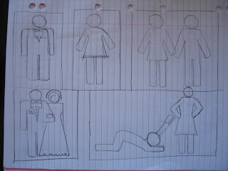
The idea is to create a series of still images that can be played as a slide show on the mobile phone. This is going to be the pilot for the series to come. The Images should look identical to the once on the sketch provided. This project is supposed to be of a non offensive, non brutal, non racial and non sexual content. It is meant to be just funny in an all culture friendly manner reflecting simplest things in life. Stickman being the international construction sites symbol it is familiar in most of the cultures around the world proving it to be non offensive and therefore the most suitable and most effective for my project.
Target Audience:
The target audience for my project would be 15+
The gender is not important because it doesn't contain any sexual/sexist content.
Description of task:
The format is the mobile phone screen size.
Create 5 black and white 2.5 inch illustrations as follows:
1st shot:
A stickman in a sute and tie on its own in the shot.(stickman is wearing a business sute)
2nd shot:
A stickwoman simple all black silhouette also on its own in the shot.
3rd shot:
Now they are both in the shot together holding hands. (They are now both just normal silhouettes)
4th shot:
Stickman is in a tuxedo and stickwoman is in a wedding gaun. They are getting married.
5th shot:
Stickman is in a lying down position on the floor looking like he is submitting to stickwoman while stickwoman stands above him with her hands on her hips in a dominant position. Something like when in the young days you did something naughty and your mother would put her hands on her hips and give you that look.
The pictogram is a very good reference but it just needs to be polished. Outside input is welcome.
Visual Diary
A visual diary is pretty much self explanatory, it is just like a
traditional diary but instead of words you have images.
We were to take a sketch out of our diary and make it in to a final design.
I have picked to do this piece out of the visual diary because
at the time when i was thinking about it i really wanted to do
sunshine and people silhouettes. That was the mood that i was
in on that day. I was happy and the sun was out. It looks a bit
different to the sketch but that's exactly what the purpose
of sketching is.
whenever you can. It will help you with the design process because by putting
the ruff idea on paper as a ruff sketch that way you will always have some reference
that you can refer back to at any stage of the design process because design does get
overwhelming at times and the designer can get lost in the work sometimes.
Using a visual diary will also improve your drawing skills.
The tools that i have used to create this piece are the wacom tablet, and the
usual Photoshop tools, lasso, brush, magic wand, eraser.
The wave was created in Illustrator.
Tuesday, May 17, 2011
Posters
Design Brief
The manifesto calls for visual communicators to put their talents to work on more worthy pursuits.
Create a series of illustrations for charitable causes to be used in marketing campaigns that addresses environmental, social or cultural crises.
Research dichotomies and opposing ideologies, branding, Amnesty International posters, Grapus, environmentalism, sustainability, multinational corporate ideology, codes of ethics, Adbusters, responsibility, human rights, homelessness, poverty, war, famine, education, gender, peace, globalization, consumerism, stereotypes and social cognition, and The Green Imperative by Victor Papanek.
The topic i have chosen is peace. I have chosen peace because i think that's the thing that the people and the world needs now the most. Our kids are the future and the future needs to be exposed and educated about peace more so that they can create a better brighter future for all.
The 15 x 10 inch poster is amed at a mature audiance. About a audiance that is very peace concious and knows the real meaning of peace. The meaning of peace consists out of many other elements like love, harmony, getting along,
no racial boundaries etc. depending how one sees it.
Having sad that i have used only a few of those elements mentioned above and utialised them to make up some graphics to sand the message what peace means to me. The 15 x 10 poster i think is very strong graphicaly and holds a strong message from people that have influanced and inspired the human kind trough the centuries. I have used for egsample one of Albert Einsteins quotes about peace.
The tools that i have used to create this poster were mostly a wacom drawing tablet without that it is nearly impossible to do a curved line in photoshop,and the rest were all the photoshop tools like the brush tool, free transform,etc. and my visual diary. Some of the elements i have got out of the visual diary that were hand drawn like the hand reaching over the barbwire.
The dove is of one of the pieces that i have done in graphics design at high school.
The barbwire was inspired by a image of a novelty roll of toilet paper.Than it was drawn and tweaked into perspective to have it look isometric that would give me that hand reaching over the fence effect.
And that's about it i have chosen a blood red background to get my point across. the reason for red is because red generally is interpreted as a color of power, dominance, war, a warning sign for something bad, love, blood, etc.
I think that i could see this poster at a protest or something like that.
The inspiration came from various resources such as the internet, Google peace posters, etc.
The second peace 3x 6x6 was aimed to be sold in three different pieces it was very hard to create three peaces that had a single meaning as a unity but also a individual meaning as individual peaces if they got sold off seperatly.
I have decided to create a feeld of peace flowers for a highschool wall or at the children hospital or something like that. I think the reason for choosing the field of flowers reminde me of kids and childhood and also the growth. Don't know very complex. Art always is. In general for the younger audience using some of the quotes about peace and the definition of peace written by they peers across the world.
Both the left and the right side have text in them accept the middle i have left the middle message out so that the audience can decide for them self what they would like to have in there, like some brain food.:) What would it mean to them? To me personally the middle link is what completes the circle and i would personally call it unity or together we are stronger.
The piece consists out of only 3 elements, the dots,the stems and the peace symbols. The text i have got of this website http://www.un.org/cyberschoolbus/peaceday/poem/poem.asp.
Very inspiring to see what the younger generation thinks what peace is.
And here is the artwork
Line Animation
Your line could be frenzied, sinuous, agitated, broken, soft, blurred, thick, congested,
etc. depending on the emotion you are depicting.
Format : 14 X 7 inches. Landscape. Full color. Series.
Technical Specifications:
Consolidate the skills learnt so far in the course.
Demonstrate creative use of the photoshop animation tools.
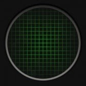
Because we are so under the pump towards the end of the semester i taught i was going to die from the workload so i taught it would be fun to do a pulse kind of something or other machine. Whatever all i need is a line animation done with photoshop.
Cool so i went on the internet and got myself a funky background for my line animation.
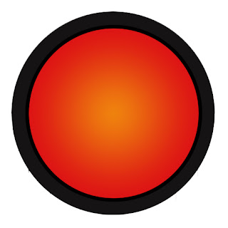
I have cut out the green grid using the marquee tool so i have two peaces to start with a foreground and a background layer and in the middle will be the animated line so that the audience can't recognize the starting and the ending point of my animation.Once i was done i have realized that my animation looks kind of repetitive after i have copied the the pulse machine and placed them next to each other. It looked like there was something missing so i decided to create a flashing red button.The button had to be hand drawn and also animated.
That simple button animation has really added to my animation.