I chose to create a trance/house music cd cover and i realy don't know why
but one thing that i kept thinking about was the universe and
the amount of shiny stars that were up there.
That kind of imagery i taught was very suitable for the style of music that
i was creating the CD cover for. So far so good, now i needed some more
images to fill the rest of the space. Again i needed something robotic, android,
mechanic or out of space or something in that direction.
Because i am also skilled in 3ds max i taught i create quickly a couple of space
ships and asteroids and use them with the backgrounds but than i have realized
that that would take up too much time and i wouldn't be able to finish it on time.
But that gave me another idea. I taught that a kind of 3d model of a head would
be really cool to have in my artwork and i should make it kind of evolve out of the
stars background. Now i had a kind of idea of what i wanted my art to look like.
So i went on to the internet to search for useful imagery and after hours of searching
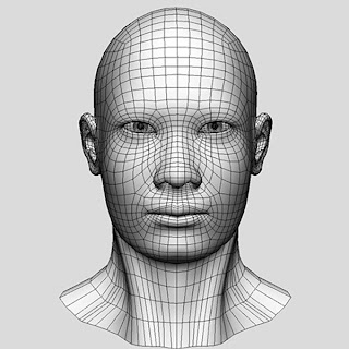
i found these images. The most pleased with i was to find the 3d head. The 3d head
had two things that i was looking for, wire-frame 3d and also the face looks a bit android
like kind of too smooth, too symmetric.


 Now that i had all my images ready i started mashing together some kind of composition.
First i have laid out all the images that i had in photoshop and stacked them ruffly on top
of each other and than i started to manipulate the opacity of the layers to be able to get a
better idea of what it would look like. In general they looked workable with, so i was very
pleased.
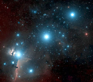
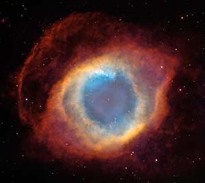
The first step was to create a background layer so i took my two stars layers that i have
chosen to work with and blended them together. It took me a while to get them to blend
seamlessly but overall i think i did a good job. The stars image with the red kind of gas cloud
had to be tweaked in size and position to get that kind of cloud ring to go around the neck
area of our 3d head to hide the necklines and of coarse to make it look like our 3d head is
emerging out of the stars. The tools that i have used to create the background were: free
transform, clone, stamp, dodge, burn, eraser, marki and the layer opacity panel.
The next step was to put in the 3d head. I have delited all the acces gray around the head so i was left just with the head. Than i have placed the head in between the two layers so that the red gas was infront of the head and than i have tweeked all the layers into position again. Than i have turned down the opacity layer on the 3d head so it gives me a transparent effect. After that i have used the rubber tool and rubbed off gently all the acces of the head image to make it blend in a little bit better.
Now i had to give it some text, name, artist, etc. I thaught i do a mixed cd so i went to the internet and did a search on trance cd's. I have stumbeld accros a cd called "100 best trance anthems ever" and have used that title. This is what it looked like at this stage.
 Well at this stage i was happy with the font so i needed to make up one because this one wasn't very clean and readable. I have just chosen one of the photoshop fonts that was the closest to it and used that. I have added a few effects to the font by double clicking on that layer from the layer panel. I have added a stroke, only a little bit of bevel and a outer glow to it, tweaked the outer glow radius and distance and the font looked really bright and spacey.
At this stage the CD cover still looked like it had a lot of empty space and needed some more work on it. I taught it would be interesting to add some kind of binary code to it and cover the empty space in the image. I have written up some random 1's and 0's across the screen, placed them in between the head and the star background and turned down the opacity on it. It started to look better but it wasn't matching the rest of the design. I have tried inner and outer glows but nothing worked do i have duplicated that same layer and thrown some filters on it down in the layer panel. With the divide filter on it some of the binary code faded and other lit up.
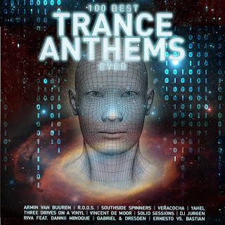
And here is the final result.
 To be continued...
I still have to make the back cover.:)))
No comments:
Post a Comment